Wrappers Delight
'Ex Africa semper aliquid novi', said Pliny the Elder in the year 79 (‘From Africa there’s always something new’). Who knows but he may have been referring to the latest dance craze out of the Congo. For the past half century, African musicians have been relentlessly inventive, creating exciting new music to stimulate their fans. As in the West, pop music affords a few the chance to show how working-class aspirations can become a glamourous reality. There is a delight in the homespun covers originating in Africa itself that reflect the hopes and dreams of the artists. Again, as in the West, there is a degree of one-upmanship. A prettier girl, more girls, more jewelry, flashier clothes, a bigger car, all signal that an artist has made it. While these follow Western models, there are of course clear differences in the degree of ostentation or the sophistication of the concept. This African graphic identity is rarely seen outside the continent except for a few stray albums that avid collectors like myself track down buried in record stores.
Some homegrown African music makes it to the West where it is re-packaged for European and American audiences with Western notions of ‘primitivism’ or novelty. Sadly, such cynical strategies of Western marketers guide much of the packaging of African music familiar to us outside the continent.
Two things are usually found on the cover of a record album: the name of the artist and their portrait. In the 1950s HMV & Parlophone in Europe marketed African music with stock photos from the bush or a portrait of the artist posing sedately with their instrument. This conceit held sway for a long time. In the 1960s many African countries attained independence and we begin to see matching suits on the band members who often were electrifying their country's folklore for dance audiences. In Guinea and Mali batik & tie-dyed prints were used to make matching dashiki pantsuits for the bands like Le Nimba de N'zerekore [fig. 38] or Keletigui et ses Tambourinis. After the 'Rumble in the Jungle' in 1974 in Zaire (the once and future Congo), local bands began to imitate James Brown and other funk heroes who came to play before Mohammed Ali danced rings around George Foreman. Trio Madjesi [fig. 39], Lita Bembo and the Stukas Boys, Tabu Ley and others grew afros and wore big-lapelled, bell-bottomed pantsuits on stage. The also affected capes and hellishly hot double-breasted suits. In Nigeria, flamboyant bandleaders Prince Nico Mbarga and Fela Kuti adopted impossibly high platform heels and bell-bottoms.
The most popular recording artists in Africa during the 1980s (when I traveled in Africa and became aware of the music), were Franco Luambo Makiadi & Tabu Ley Rochereau. With success they got fatter and loomed larger on their albums, ’til only their heads appeared. A shot of the crowd enjoying Tabu Ley’s show on Jalousie Mal Placée (Star Musique SMP 6005 1982) has an inset photo of him at the top. Franco’s Orchestre T.P.O.K. Jazz Live chez < Un-deux-trois > à Kinshasa (Editions Populaires 1977) is so sure of its market that neither his name nor likeness appears on the sleeve. Another Star Musique album, Je Suis Mariée by Shama Shama de Mopero Wa Maloba (SMP 6007) shows a group of young men who saw the camera and decided to get into the picture.[fig. 1] A man in the middle is pointing out the real Mopero, who is standing up (third from left) but still hard to make out. Someone proudly holds up a shopping bag with a Union Jack on it. The cluster of street kids, shoeshine boys, schoolboys and passing salesmen give a real glimpse into his fan base. The large band poses a problem for photographers. To get them all looking the same way or smiling at the same time is hard enough, but the vanity of artists is legendary, so often the cover shot is a composite, or, in the case of Orchestra Baobab de Dakar’s Gouye-Gui (B.S.15155-01 1980), a drawing (by Djibathen Sambou).[fig. 2]
Also hand-drawn, the Music of Africa Series #5: The Guitars of Africa, recorded by Hugh Tracey in 1952 (Decca LF1170 1954), [fig. 6] takes the safe approach to locating the music — with the background map of the dark continent — and the content: anonymous negros holding acoustic guitars. They could be American Delta Blues singers — in fact there is a similarity in the music. The word 'Africa' has been treated with ‘chisel’ marks. Phillipe Mehul’s Parisian design for the cover of Les Maquisards et Sam Mangwana Merveilles du Passé 1968 (SonoDisc African 360.166) updates the best elements of the overdone conceit & designers' frequent last redoubt: the map is cut out in a chunky manner and centred in green on tan. But his label, SonoDisc, were so lazy they used the same cover art for four different albums and it took me some time to notice that they were by different artists. In the 1980s I worked in a 'world music' record store and, frustrated by the total lack of information in SonoDisc albums, considered making a rubber stamp reading 'What are you looking in here for?' to stamp in the blank insides of all the CD covers.
The worst aspect of the Tracey cover — anonymity — is ampli&Mac222;ed by bad cropping and vignetting of the coarse halftone cover for African Acoustic Vol 1. Guitar songs from Tanzania, Zambia & Zaire (OMA 108 1988).[fig. 7] To compound matters, the lettering is very un-African and in the worst colour choice for legibility: orange. The now-defunct publisher, Original Music of Woodstock, New York, had a solid ratio of good music to bad sleeves. Their house style was gauche: this dreadful rub-on type (University Roman) recurs on almost all their African issues, as well as the murky vignetted or posterized photography. But there is a precedent, for, when something is this ‘bad’ in an African context, we find it charmingly ‘authentic.’ We smugly assume that unsophisticated designers without access to modern typesetting or camera equipment produced such work. Often there are glaring typos in the titling. Nguashi Ntimbo’s brilliant 1982 album, Shauri Yako (ASLP 936), has typical layout ‘problems’ indicating authenticity and urgency. [fig. 8] The coarse 65-line screen halftone of the artist is printed in pink, further obscuring it. The ‘Bauhaus’ attempt to balance the type fails because the outline type (Cooper Bold again) for the name is too light and is dragged off the page by the anchoring lines which have been added as a ‘designy’ touch. The badly spaced Helvetica statically fills the centre. The blue on blue title is obscured.
Another ‘man with guitar’ trick was cobbled together for Syran Mbenza’s Kass Kass (misidentified as Bana on the cover!) put out by the African Music Gallery of Washington, D.C., in 1987. [fig. 9] The Cooper Bold inside hand-drawn stars is a tired cliché, but the worst part of the design is the large left-handed bass guitar he is holding aloft. Syran plays the six-string guitar, and very well. Ibrahim Kanja Bah, the publisher, doesn’t give much thought to his packaging.
Admiral Dele Abiodun’s name, set in a grotesque ‘batiked’ typeface is almost unreadable on his sleeve, the typesetter seems to have substituted an ‘a’ for the terminal ‘n.’ The batik touch resurfaces on other West African albums: Hi-Life Stars International, and Segun Adewale’s Yo-Pop dance smash, Play for Me (Sterns 1003). Ankobra, who executed the batik for Adewaley’s cover, created a vibrant embroidery for that artist’s follow-up, Ojo Je (Rounder 5019 1985).
In Western designs, African art is often commissioned for covers, but more common is the appropriation of folk art to suggest the grass-roots qualities of the music. [fig. 10] Orchestre Makassy’s smoking Agwaya (Virgin V2236 1982) has a lively painting of a nightclub. The interior of a club by Jerome Ramedane graces Bibi Den’s Tshibayi’s ‘The Best’ Ambiance (Rounder 5012 1984), the casual look of Menhart Manuscript (1949) is a good application of an unusual and appropriate type. Nyboma’s hit album Doublé Doublé (Rounder 5010 1984) has a pretty awful painting by Moke lending credibility to the American-designed sleeve. Sam Mangwana & l’African All Stars self-titled Celluloid album (CEL 6639 1982) features Cooper Bold for the singer’s name and a painting of a grand steamer on the Congo River by A. J. Bernard; Best of Ambassadeurs (Celluloid 6640), featuring vocalist Salif Keita, depicts African beauties of the type seen on hair saloon signs, also painted by Bernard. [fig. 40] The ‘beauty-parlour’ script lettering and pink speckled background are rather putrid, but colour clashes help focus attention on the cover. A truly fine example of a folk painting of Mamy Wata can be seen on the cover for Kanda Bongo Man’s Amour Fou/Crazy Love (Carthage Records CGLP 4432). Swahihi Records’ 1983 12-inch of Prince Lessa Lassan’s Djalenga has a mermaid cover painting by Rosemary Harrison. D.O. Misiani’s Piny Ose Mer featured a 1987 cover painting of the band by D.B.C. Ringo Arts whose work was also featured on the cover of The Nairobi Beat compilation (Rounder 5030). Earthworks’ 1990 and 1991 compilations Guitar Paradise of East Africa and Kenya Dance Mania had cover paintings of musicians by Zembi Okeno, also of Kenya.
Western marketers of African pop use hyperbolic clichés to dress up South Africa's Ladysmith Black Mambazo -- following its success with Paul Simon's 1987 Graceland -- as fierce warriors in grass skirts, on Induku Zethu (Shanachie 43021 1984). Great talents such as Mahlathini and Mahotella Queens or Amaswazi Emvelo were also transformed, with only a hint of irony, as vaudeville Zulus for their album covers. Such graphic condescension follows the tradition of Paul Colin's 1927 French cabaret posters that depict Josephine Baker in a comic-erotic banana skirt. Questionable images can be seen on Ferrant’s cartoon of partying natives in grass skirts swinging through the trees on the cover of Conjunto Estrellas Africanas volume 1 (Abidjan: Disco Stock LPDS7901). [fig. 16] This album of Afro-Cuban jazz, pressed on red vinyl, features Dexter Johnson on saxophone and Alfredo de la Fé on violin (no sign of his brother Otto da Fé, however). Disques Kouma (who specialised in Orchestra Broadway and other Cuban big bands) used a cartoon of the band atop a railway train for Mélodias Rail Band du Mali in 1976. Kenya Partout! Volume 6 by Orchestre Sega Sega (Playa Sound 33006) features a fetching young Masaai woman who seems not unaware of the crouching photographer’s pin-up intent on her bustline. Further ethnographic studies can be found in the similarly posed Masaai girl on the cover of Envoûtante Afrique Noire (Disques BAM LD 5409, a subsidiary of the OCORA label of French national radio). [fig. 17] The cover for this sampler by Rapho is cropped painfully across the girl’s nipples. Sex sells and a beautiful near-naked 'exotic' girl, as seen in Alpha Bah's photo on the cover of Special Xème Festival National (Syllart SKP50), has a greater appeal than a dark shot of a band performing. [fig. 41] The typeface for this particularly striking cover among Ibrahim Sylla's many wonders, is in Mecanorma Neo Script which was released as a rub-on type in 1978. Jacinto Tchipa of Angola posed with a troupe of small girls in tiny skirts on the covers of A Cartinha de Saudades (Endipu UUE LP004 1990). [fig. 18] It is printed out of register. Another French entry in this ‘ethnographic inquiry’ category is Golden Sounds of Cameroun’s cover for Zangalewa (Sono DTC 014 1986): three band members pose as overweight white colonials, in topees and military coats (one seems to have a basin on his head!), parodying the cliché and turning the tables for once. [fig. 19]
In the 1980s, African bands spun their haute couture around as le sape (for sapeurs, paragons of outrageous fashion). The Société des Ambianceurs et Persons Elégants, founded by Congolese pop star Papa Wemba in 1979, was Zairois punk: a youth movement aimed at subverting dictator Mobutu Sese Seko's sartorially repressive Authenticité movement. After Wemba moved his group Viva la Musica to Paris in 1989, his love for haute couture eclipsed his songwriting. David Byrne undoubtedly copped the 'Big Suit' ideas from Papa Wemba. One band-member, Kavudila, changed his name to Modogo Gian Franco Ferre. Soon enough, the better-known Franco, Godfather of Congolese pop, was posing for the cover of L'Animation Non-Stop in front of a Brussels haberdasher -- whose name appears in larger type than the album title!
Paris has long been a Mecca for African musicians and its influence has had a deleterious effect on their music and aesthetic. But it is quite common for bands, once they’ve made it in the metropolis, to put out an album with à Paris in the title. Le Negro Band à Paris: À Tout Casser (Pathé Marconi 2C 054–15054) [fig. 3] is an early example from 1968. The only indication that they are in Paris is the overcast sky and the fact they are all wearing jackets and gloves, but they could be on a football field in Kinshasa. (Not that I’m suggesting they never got to Paris: they appeared on French television while there.) The Cooper Bold title is a familiar one for African records (subsequently eclipsed by the popularity of Neuland, then Lithos, as redolent of la force primitive); the secondary type is Ludwig & Meyer Charleston (brand new at the time the cover was created), a brush-drawn Jugendstil letter with the dark colour of Eckmannschrift. Other à Paris albums have been recorded by Choc Stars and Somo Somo from Zaire, Mory Kante, & Les Amazones de Guinée. Mangwana présente M’Bembe Congo Man Paris is a generic soukous record on the Tsavo label from Kenya. The sleeve has a picture of the Paris Opera House. The ultra-cool Orchestre Viva la Musica refuse to stick to the cliché of the Eiffel Tower, or admit they live in the drab suburbs of Paris, so, for their 1989 album, fronted by Modogo Gian Franco Ferre, they chose Place Vendôme. When Orchestra Baobab made the trip in 1978 they didn’t document it photographically. Their On verra ça came out in a plain white sleeve with rub-on type. My copy, which turned up in Senegal over 20 years later, has been through the mill and has writing all over the cover, adding to its design, including attempts at display lettering and various columns of addition. [fig. 4]<#4> A close examination of the seemingly mundane rub-on type reveals that it is a hybrid font. Mostly it is Churchward Galaxy bold, but, having run out of letters, the artist added a Ronda Bold ‘à’.
While Les Veterans of Cameroon stayed au Village in 1985, wider horizons are suggested by Toure Kunda’s Paris/Ziguinchor, Zaïko Langa Langa’s De Paris à Brazzaville, Ray Lema’s Paris-Kinshasa-Washington, D.C., or Soweto-Paris by Mahlathini and the Mahotella Queens. In 1983, the Amazones de Guinée made the pilgrimage. Their Au Cœur de Paris (Conakry: Syliphone SLP 76)[fig. 5] shows the band in front of the Eiffel Tower, the obvious landmark. The doubters will insist that it’s a matte shot. The endearing quality of the ladies (who are all police officers!) is emphasized by the red heart-shaped vignette.
The typography of Third World music, whether traditional or modern, has invariably been subjected to notions of the jungle. This is exempli&Mac222;ed by Request Records’ cover for Songs of the Guiana Jungle by Ramjohn Holda and the Potaro Porknockers (SRLP 8039): the bamboo lettering over a dank jungle shot was probably shot in Kew Gardens. [fig. 20] This cover was printed letterpress from Futura and Garamond type. The large banner screaming STEREO at the top helps date it (The &Mac222;rst stereo LPs were sold in 1958). Don't ask what a Porknocker does! Holda later gave up singing for acting.
A decade before reggae music took off in the 1970s, Jamaican ska was marketed to tourists as island fun music with shots of tropical beaches. Pioneer reggae labels, like Studio One, struggled to get their product into reasonably competent packaging. The early John Holt & Friends: The Paragons’ record, featuring ‘Wear you to the ball,’ has jumbled rub-on type that has been silkscreened in two colours for a barely legible cover.[fig. 21] A friend found it in a thrift store and, after much finagling, I managed to wrest it from him.
Lassissi productions from Abidjan, Ivory Coast have a fondness for 70s type that looks ‘African’ with visual suggestions of afros and platform boots. The cover of Mitzoto-Wela-Wela’s album (Sacodis LS45) [fig. 22] is in an art nouveau typeface called Metropolitaines (Fonderies Bertier, 1905), issued as a photo-type called Abdul. The snapshots, however, have been printed too dark to read. This early ‘School of Zaiko’ out&Mac222;t (formed in 1972) are generally called Minzota Wella Wella.
The Peacocks Guiter (sic) Band plays a rootsy form of Nigerian highlife. The cover for Abiriwa in blue, black and brown (EMUI NEMI LP007) was designed and hand-drawn by Acho K. Ajoku of Denix graphic in Ikeja. [fig. 23]<#23> I show the back cover. The word ‘Peacock’ is based on 70s ‘computer’ lettering. Adu Kwasi Band of Ghana also have a three-colour cover for Saman Me, produced and marketed by Tabansi Agencies, with branches in Ikeja, Onitsha, and Enugu. [fig. 24]<#24> The main title is in Roger Excoffon’s Calypso (Fonderies Olive, 1958) with a hand-drawn shadow. The album title is in Herb Lubalin’s Avant Garde light and the other sans include Folio Caravelle Bold condensed. On the back this type has been manipulated to create the special characters needed for the Ghanaian language, a real asset of rub-on type. Poatson of Ikeja, Nigeria also produced the slick silver cover for the 1976 classic Igede Fantasia of Celestine Ukwu and his Philosophers National (Polygram PL 6361 159). [fig. 25] His name is in Pluto Outline and the title in Praetorian, both marketed by Letraset. Vata Mombasa’s excellent album, Qui ne risque rien n’a rien (Abidjan: Papa Disco, 1983), is a clumsy paste-up with hand lettering and strips of rub-on type that have been coloured with felt pens to blend into the background.[fig. 26-a][fig. 26-b]
In January 1979 one of the greatest East African stars, Mbaraka Mwinshehe, died in a car wreck. Polydor of East Africa put out a ten-LP set to commemorate his work and capitalize on the sentiment of his fans. The typography in Souvenir demi bold was funereally dropped out of a black background.[fig. 27]
When Franco Luambo Makiadi died a decade later, a similar design structure was employed for ten Kenyan albums memorializing his work. [fig. 28] From the sound quality and lack of copyright information they seem to be almost certainly bootlegs. The haste of production can be seen in the identical header slugs for each album that read ‘IN MEMORIAM’ in Hermann Zapf’s 1953 Sapphire type, then Franco’s name appears in Broadway, with the volume number stripped-in in Stephenson-Blake’s Sans Serif shaded. (All of these types were available in rub-on letters from Normaltype.) They made a PMT to reverse the type and lost some of the definition.
Top in Town Printing Works of Nairobi, Kenya, who also do work for Tanzanian and Congolese groups, create the blurry colour Xerox look of bootlegs, but they are quick to add an anti-piracy logo to their sleeves. It is an updated skull and crossbones, the skull being a cassette. Wildly mixed fonts and off-register colour are their hallmarks. They use a process camera for stats and colour-separations, and some of their clients bring artwork to them made from rub-on type.
Two more Polydor albums employing rub-on type are Nuta Jazz Band’s Zilizopendwa (POLP 557), released in 1987, but consisting of pre-1977 recordings.[fig. 29] It has a busy (and unknown to me) rub-on type for the main lines, Letraset Premier Shaded for ‘Old is Gold’ and Univers 65 caps for the song titles, which are set flush right. Because of the weird main type, the most readable line is the secondary information (‘Old is Gold’), a clear case of the hierarchic structure of design breaking down due to too much visual noise. Isse Isse Stars’ 1980s’ Ndugu Tuelewane (POLP 563) uses ITC Tiffany Heavy for the title and Martin Wait’s Cathedral (Letragraphic, 1985) for the band name. [fig. 30] Note the initial ‘N’ in ‘Ndugu’ is upside down. (The soukous/ reggae band, whose name is mis-spelled on the sleeve, didn’t last as they were playing on borrowed equipment). The designer used the leftover lowercase Cathedral letters for an album by Sammy Mwambi, Dunia Haina Siri (POLP 603) that incorporates a ‘man and guitar’ action shot.[fig. 31]
Most of these designs show a passion for cluttered typography and the very ornate types marketed by the dry transfer companies. The typography veers indiscriminately from Baroque to Sci-Fi. A rare album on the Vévé label, The Very Best of L’Orchestre Lipua Lipua (VVLP 1007), uses Tango for the dropped-out header plus a couple of other highly decorative rub-on types. [fig. 32] Their name is in Alan Meeks’ Candice outlined; ‘Mfueni’ is in Loose New Roman. Lipua Lipua were typical of a Verckys’-produced band in having a double-name. From their ranks came Nyboma, Vata Mombasa and Mulembu, purveyors of imaginative and sweetly-sung soukous.
Having covered photos of the artist, maps of Africa, references to Africa in batik, and typography, what remains? For some reasons African record sleeves often have photographs of large buildings. This is clearly an attempt to show how far the encroachments of Western civilization have penetrated the continent, like the cover of Harare by Real Sounds (ZML 1015). But the very grainy highrises on the cover of Stars from Zaire vol 4 (Soundpoint 042 1983) could be Paris (this Lagos pressing also has, naturally, stars). [fig. 11] The design was done by Poatson Graphic Arts Trade Ltd of Maboju-Ikeja, who also printed the cover for Sam Mangwana’s immortal Maria Tebbo (RAS LPS 012 1980) album. [fig. 12] The Paris’ perifrique freeway and a few large buildings dot the background of this sleeve. A beautiful aerial view of Dakar by Michel Renaudeau, with lots of colourful plants in evidence, covers Etoile de Dakar’s Thiapathioly (MCA 302 1983).[fig. 13] Like the Stars from Zaire vol 4 the main title is in Letraset Dynamo (by Alan Meeks, 1977). Poatson printed covers for Celestine Ukwu, Dr Victor Olaiya, and Chief Stephen Osita Osadebe through the seventies, many of them designed by Ghariokwu Lemi Arts who later attained fame for his covers for Fela Anikulapo Kuti. Starting in 1974 this young Nigerian artist created 23 covers for Fela, many influenced by the psychedelic covers of British bands. There is a clear parallel in Cream's Disraeli Gears, etc, to some of the Fela covers and in fact, Ginger Baker, Cream's drummer was a close friend of Fela. Lemi's trademark style of intricate collage with his own illustrative talents became a visual shorthand for the whole Afrobeat genre that exploded in the wake of Fela's 1997 death.
A truly incomprehensible cover is that for the great Tanzanian dance band, Orchestra Maquis Original’s Karubandika, issued by Ahadi Records in Nairobi, 1986. [fig. 14] When I found this in England in 1987 I jumped on it sight unheard, despite the fact that £7.49 was the most money I’d ever paid for an LP. I only knew one song by the band and this album had such a desperately poor cover I knew that they had put everything into the recording and nothing into the packaging. The image, a British street scene with the back end of a bus rounding a corner, was inexplicable. The type, yellow Cooper Bold, vanished into the picture. What was going on? Did the printer happen to have spare colour separations from a poster that he could trim to fit the 12 inch square? How was this supposed to relate to Dar Es Salaam? Never mind, it’s a great record. I wrote the producer Doug Paterson and received this reply: ‘The song “Karubandika” is about a guy who pretends to be something he is not. He pretends to be a businessman but he sleeps in the bus stand (kituo cha UDA [Usafiri Dar es Salaam]) and begs for cigarettes. So we went to the guys who print the album sleeves, Top in Town, and we asked them if they had any picture of a guy in a bus stand. All they could come up with was a London bus. We didn’t know anything about the design process and the albums were ready so we just said, go ahead and put the bus on the cover. That’s it.’
This readymade aesthetic spans many cultures and can be seen also in Cuba. El Cubanisimo of Trio Matamoros (LD-4054) is a record published in Havana. [fig. 15] Cashing in on the periodic popularity of this evergreen group with tourists, Egrem, the National record company of Cuba, licenses selections of their recordings (originally published as 78 rpm discs) in sleeves that are letterpress-printed with stock blocks that probably function as postcards for the tourist market also. A two-birds-with-one-stone job for the printer. The licensee in this instance is Areito and they proudly proclaim this to be in ‘Falso Estereo’!
A perceptual shift happens when record companies switch to CD (though the African market is still deeply into cassette tapes). The first casualty is legibility. Problems arises when the concept for a 12-inch record is shrunk to 30% of its size to fit onto a CD cover. A couple of glaring examples will suffice here. The Paragons (mentioned above) who sang at Studio One, also recorded for Duke Reid’s Treasure Isle label in Kingston, Jamaica. When their song ‘The Tide is High’ was covered by Blondie and became a pop hit in the US, there was a rush to find the original (a far superior rendering). In 1995 Rhino Records in Los Angeles reissued a collection of the Paragons’s songs and used the cover photo from On the Beach. [fig. 33] The reissue is quite inexcusable. They didn’t include the songs from On the Beach, but added ‘Sly & Robbie presents’ to the cover. (Sly & Robbie are studio musicians well-known to younger reggae fans in the USA but they were not major players in those early days.) Rhino then took the poor half-tone photo (probably from the Kingston Daily Gleaner files), compressed it and darkened it, completely ruining the image.
An equally callous move was made by the sloppy SonoDisc of Paris when it came time to convert their Congolese albums to CD. For the Bantous de la Capitale reissue they discovered they had lost the original art and only had the cover of the record which had been doctored with bad hand-lettering superimposed. To avoid any further expense they simply scanned the LP cover and distressed the edges of the photo to cover up their little problem.[fig. 34] The original recordings were made in 1962–4. SonoDisc somehow lost half the tracks and re-labeled the recordings as 1963–9.
The wall of CDs at left show the undifferentiated mass you might encounter while browsing. [figs. 35a & 35b] Here are a dozen latin albums that show conga drums on the cover. No need to explain the visual shorthand here. Patato Y Totico is particularly poignant. There’s Patato sitting on the kerb in Washington Square Park wondering if Totico forgot their session date. The use of Lithos, Hobo and Cooper Bold types needs no further exegesis.
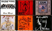
The half-dozen Haitian albums below show how primitive drawing, suggestive of Voodoo art, is used to scare up consumers for this music. Another easy cop-out here is that the art directors don’t bother setting any actual type, they just have the artist scribble something in and go with that.[fig. 36]
Just to end on an upbeat note, there are some companies doing a lot to preserve the musical heritage of Africa. These are mostly small labels run by one or two people, without the budget or distribution of the mega-corporations, however they still manage to put out well-packaged albums. The Popular African Music label of Frankfurt is one such enterprise.[fig. 37] I show their CD packaging for a reissue of music recorded in the 1950s and 1960s in the Congo and originally issued on the Ngoma label. These recordings are now extremely rare. At the left is an original Ngoma 45 in a picture sleeve, from my collection. The CDs are slightly smaller, but are packaged in cardboard with a minimum of plastic. They include booklets that tell the story of the label with illustrations and give transcriptions and translations of the song lyrics, as well as dates, personnel and other pertinent information that makes your listening so much more enjoyable. The attention to detail is wonderful: the CDs themselves are printed with a little spiraling shine to look like old 78 rpm records. Bougie ya motema!!
Copyright © 2005 by Alastair Johnston
an earlier version of this article appeared in PRINT magazine (New York)
|
|
|